Wednesday 27 April 2011

EVALUATION


Above is our final video.

In what way does your media product use, develop or challenge forms and conventions of real media texts?
Songs of this genre either have a massive storyline or they just predominantly performance shot, and we challenged that by using a mixture of both. From looking at the music videos early on in our project, we narrowed it down to two of them to take inspiration from and then combine that inspiration with our own ideas.

How effective is the combination between your main product and ancillary tasks?
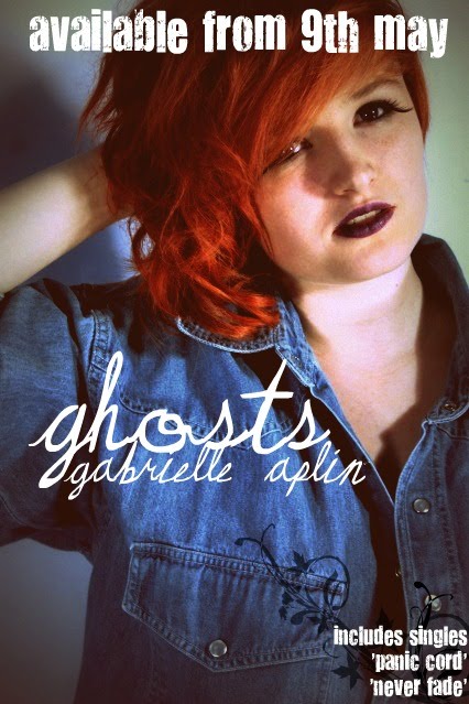
Our ancillary texts are different to our video in the respect that the images portrayed are more produced. Our video is quite natural, I’m not wearing makeup, or flash clothes because I don’t think it fits the nature of the song. The reason we changed this for the digipack is that we need to make the single/album more appealing and what better way to do that than make me look more appealing. The music industry is very much based on sex appeal, and if you look at posters/album covers of most artists of today, you will notice how made up they are to get their viewers attention. We made sure that the lyrics of the song were included in our digipack as that is what a lot of artists do, and we thought it would be fitting. We also included a 2 photo pages with a lyric at the bottom of each, a page full of feedback from fans of Gabrielle, and of course, the front cover. Our music video is based on two videos that we both love, one was full of narrative, and one full of performance shot. We decided to have more performance than narrative because it was easier to film performance and get it looking great, than to film narrative.
Though there isn’t much to link the ancillary and video bar the song, and performer, I think it is good as it means that specific digipack can not only relate to that music video, but to others that the singer might want to release.

What have you learned from audience feedback?


I've used lots of different social networking sites to collect feedback for our video. I posted the link over Tumblr, which is the top photo, and people liked it and some commented. I also posted it on Facebook and got a fair amount of feedback. I agree with the majority of what is said, as I feel like it isn't varied enough location wise, and that the camera was very still throughout most of the video. I then posted it on Twitter and got a little more feedback, the main one here was about it being out of sync a little bit. I am pretty sure that this is just down to Youtube, as when it is on the mac it is in sync perfectly.
I now there is loads we could improve on; for instance, the cuts between shots could be smoother, we could have used more transitions and made it look as though it flowed more. Also with locations, we could have used more and created a better story that wasn't as vague throughout the video, using different shot types and movements as we went along.
I have also learned that it is actually an acceptable music video, especially for this genre of song. I was worried we did not have enough footage to make it look decent, but the minimal effect worked out well for us.


How did you use new media technologies in the construction and research/planning and evaluation stages?
Due to so many distractions over the last year, we haven’t been able to complete the music video that we had once wished to complete. Fortunately, we got it together and made a video we could be proud of.
Technically, our knowledge of the media, and the techniques used to create a video have advanced since last year making our film opening, but because of circumstances we haven’t been able to prove that in our video. Saying that, we have looked into other music videos in detail and taken ideas from those and incorporated them into our video. We also spent a lot of time making sure we didn’t overuse shots and had a wide range of them to make sure that our video can look as professional as we could make it. We spent a day filming different shots in the same outfit so we could have a range of shots to use in one sequence or throughout the entire video. In the space of a year we have progressed massively, last year we didn’t really know much about how to make a good video, but having got a great mark last year, it proved to us that we could do it, and we could do it well. Whilst researching for our ancillary tasks, we looked into photographers who almost always shoot music videos, or CD covers. We thought this would be the best place to start, as they know most about what we are working on. We looked at photographers such as TOM BARNES and TOM LEISHMAN for inspiration on our CD covers and digipack. We found images that we really loved and some we incorporated into our music video itself, others we left as they were too technical to complete for us. I researched what Gabrielle’s fans wanted to see via Tumblr – a new blogging site, Twitter and Facebook. I used these because she has a big, loyal fanbase over the internet and I could easily reach out those who listen to her by these 3 things. The internet has become such a great asset to the music industry, and it is used frequently throughout different aspects of it.
We started planning the music video very early on, and infact, hardly any of the original ideas are in the video. This is due to me not being in for a very long time, but in the last few weeks we have got into gear and planned and created a video that we have now finished to a relatively high standard.
We used the new HD digital camera to experiment with shots in the first few weeks of filming. We filmed me holding a book, and then we took the camera in and out of focus. We then tried this with the trees outside and got a really nice effect that we could have used in our video but chose not to.

DONE!

We have finally finished our ancillary and our main project. I am pleased with the outcome of what we've achieved and though neither are how we had first invisioned them, we are pleased with how they have come out.

Digipack part 1.
We used different photos of me from the photo shoot we had recently had to make a collage. We thought that this would be a good idea because a lot of digipacks do actually have this incorperated in. We carefully chose photos that we thought would look good together and added black paint splats around a lyric from the song we chose to make a video from. We've kept the theme of having paint splats throughout the digipack so that it looks like it all belongs to the same package.
Personally, I think it looks really professional, and I am very pleased with how everything came out for this page.

Digipack part 2.
This is probably my favourite part of the digipack! I really love this photo, and how bold an image it is. It really suits it, just having this image on the page instead of a collage. The colours stand out, and the lyric looks really good at the bottom. We decided to have it on a slant to give it a different feel, and make it look more asthetically pleasing, compared to having it straight like it was on the other one. It is always good to have a bit of variation.
As you can see, We've got a border this image. We used this because we think it looks good as it makes the image more definite.
Feedback from people via social networking.
We decided to use our social networking sites to ask people what they thought of the song. Being friends with the singer herself, it made it easy to get some feedback because everyone is willing to tell you what they think! I like this because it shows what people genuinely think of the song, and it could even convince someone to buy the CD because people like it so much. We used the image of me facing the back and turning my head because it was a good full length shot, which we havent used before, and it gives the whole project some variation.
Final CD cover.
This is our final CD cover. I really like this image as it is taken at a really nice angle. The image in itself is interesting due to both the angle its taken at and the colours that are in the photo. The image itself is full of bold colour, and great lighting. It is definitely a good choice of image to use for a front cover.
We experimented different fonts for the title and for her name as we thought the same font for both would be a bit strange. We came up with the idea of an italic font for the title, and for it to be much bigger.

Lyrics.
We thought that we should have the lyrics for Ghosts in our digipack somewhere. Usually, a digipack for an album will have the lyrics to all the songs that are featured, but because we don't know the whole of the album and the lyrics to the 'songs', we can only have it for the one. Again, we've put the paint splats on this page due to keeping up with the theme. It makes everything much more fluid, and makes it all relate to each other which is good. Also, it makes it look good.

Because we didn't have a poster advertising our CD, I made one in photoshop. I tried to make it appealing as possible, using a photo that we used in our digipack to make it more familiar to the people we had targeted as our audience.
This is what I came up with:
I decided to put the date that it was released onto the poster in a bigger font so that it would stand out and people wouldn't have to search to find when it would be available. I did the same with the song title and artist name so people would be aware of who's poster it was straight away.
Using a photo we'd already used is a good idea because it links the two together, and makes it more connected. If we had used a completely different image, it could have been promoting something else. I looked at a few posters that advertised CD releases and they had a small section in the corner saying what other songs that our audience may be familiar with, so I put one in there too to follow the conventions.

Wednesday 16 February 2011

MORE.


This is another way we have been accumulating feedback. Through the use of tumblr. It is a blogging site that has only recently become popular. I think that in the next year, tumblr will be the more popular social networking site.


We've also used facebook. I thought it'd be easier to post on Gabrielle's fan page, as she has over 13,000 fans on there so it would be relatively simple to get some feedback.

FEEDBACK.


We started looking for feedback from some of Gabrielle's fans today. We want to use what they have said about her song in our ancillary task for our CD booklet. We thought that it would be cool to have a few quotes, saying what they thought of her song in the last page. I think it gives it a more personal feel, and proves how much she cares about the fans.

Tuesday 8 February 2011

PROGRESS

I haven't updated this in a while due to preparation for our exam, so here is a little update just to say what we've been doing over the last 2 months.

In retrospect to our project, I can't say we've made much, if any progress in the past 2 months, but we've talked about what we're going to do, and what we think would work well in our piece. We've just taken quite a few shots for our ancillary task, and though they may not be exactly what we stated we'd like them to look like, I think they could work well. We experimented with fonts beforehand, and have those ideas written down so we can go back to them if we want to use them.

We used our original ideas for where we wanted to take the photos, which was good as it is close, and looks quite picturesque. It is a simple place to take simple shots, we will edit the shots to make them more how we would like them to look.

Videos we've used as inspiration for our video:


We took ideas from both of these videos, and incorperated our own. Although we don't have as much range in narrative shot as we would have liked, I feel that the video has come together well and could still be good. I am really pleased with what we've accomplished as we've had lots of distractions when it came to the video itself.

These two videos gave us ideas for the narrative, and shot types. Especially Clean White Love, we took most inspiration from this video. It is a vintage style video and it looks really good with that style of song.
We looked into so many different videos from this genre of music (Acoustic Ffolk pop) and these are the two that stood out to us the most.