
We used different photos of me from the photo shoot we had recently had to make a collage. We thought that this would be a good idea because a lot of digipacks do actually have this incorperated in. We carefully chose photos that we thought would look good together and added black paint splats around a lyric from the song we chose to make a video from. We've kept the theme of having paint splats throughout the digipack so that it looks like it all belongs to the same package.
Personally, I think it looks really professional, and I am very pleased with how everything came out for this page.

This is probably my favourite part of the digipack! I really love this photo, and how bold an image it is. It really suits it, just having this image on the page instead of a collage. The colours stand out, and the lyric looks really good at the bottom. We decided to have it on a slant to give it a different feel, and make it look more asthetically pleasing, compared to having it straight like it was on the other one. It is always good to have a bit of variation.
As you can see, We've got a border this image. We used this because we think it looks good as it makes the image more definite.

We decided to use our social networking sites to ask people what they thought of the song. Being friends with the singer herself, it made it easy to get some feedback because everyone is willing to tell you what they think! I like this because it shows what people genuinely think of the song, and it could even convince someone to buy the CD because people like it so much. We used the image of me facing the back and turning my head because it was a good full length shot, which we havent used before, and it gives the whole project some variation.

This is our final CD cover. I really like this image as it is taken at a really nice angle. The image in itself is interesting due to both the angle its taken at and the colours that are in the photo. The image itself is full of bold colour, and great lighting. It is definitely a good choice of image to use for a front cover.
We experimented different fonts for the title and for her name as we thought the same font for both would be a bit strange. We came up with the idea of an italic font for the title, and for it to be much bigger.

We thought that we should have the lyrics for Ghosts in our digipack somewhere. Usually, a digipack for an album will have the lyrics to all the songs that are featured, but because we don't know the whole of the album and the lyrics to the 'songs', we can only have it for the one. Again, we've put the paint splats on this page due to keeping up with the theme. It makes everything much more fluid, and makes it all relate to each other which is good. Also, it makes it look good.
Because we didn't have a poster advertising our CD, I made one in photoshop. I tried to make it appealing as possible, using a photo that we used in our digipack to make it more familiar to the people we had targeted as our audience.
This is what I came up with:
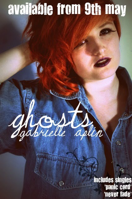
Using a photo we'd already used is a good idea because it links the two together, and makes it more connected. If we had used a completely different image, it could have been promoting something else. I looked at a few posters that advertised CD releases and they had a small section in the corner saying what other songs that our audience may be familiar with, so I put one in there too to follow the conventions.
No comments:
Post a Comment